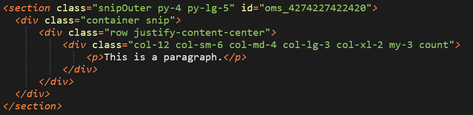
Basic Snip Structure
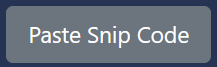
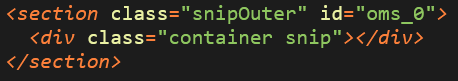
To start a snip, we Paste Snip Code, where our cursor is...

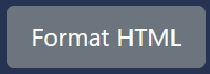
...and then Format HTML to get this:
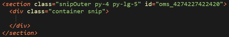
Now add some standard stuff: py-* is for padding above and below, based on screen size, and the ID is a random string of numbers, needed in case you want to save the snip later. Learn more about py-* (padding/margin stuff, below.)
Then we add a row and columns for a basic, finished snip. We add .justify-content-center to the .row so the columns stay centered.
Bootstrap uses a 12 column grid system by default:
So in this example .col-12 = 100% width on mobile screens. col-sm-6 = 50% width on small tablets. col-md-4 = 33.333% width on regular tablets. col-lg-3 = 25% width on laptops. col-xl-2 = 16.667% width on desktop monitors. Learn more about this and media queries, in the next section.
Then we add .my-3 and .count to add vertical space between columns when they stack, and the little +/- buttons to duplicate columns.
Paddings, Margins & Media Queries
We can use Bootstrap classes to add paddings/margins based on media queries (which is nerd talk for device size,) just like we set columns (section above) based on media queries. This applies to a number of other items as well, as documented HERE.
Refer to "Responsive Breakpoints from the Bootstrap 4 docs for more information.
(This is a lot to take in... but as you read through these notes, and look at snip comments on the /snips page, it will make more sense.)
Top-Down media queries
- @media(min-width: 1200px) = xl (large screens)
- @media(min-width: 992px) = lg (laptop screens)
- @media(min-width: 768px) = md (tablets)
- @media(min-width: 576px) = sm (small tablets)
- @media(min-width: 1px) = undefined/default (phones)
Bottom-up media queries
- @media(max-width: 9999px) = xl and above (large screens)
- @media(max-width: 1199px) = up to xl (laptop screens)
- @media(max-width: 991px) = up to lg (tablets)
- @media(max-width: 767px) = up to md (small tablets)
- @media(max-width: 575px) = up to sm (phones)
Knowing the above information, we can apply paddings and margins simply by using classes.
- p-3 (padding all sides = 1rem)
- px-3 (padding left/right = 1rem)
- py-3 (padding top/bottom = 1rem)
- pt-3 (padding top = 1rem)
- pr-3 (padding right = 1rem)
- pl-3 (padding left = 1rem)
- pb-3 (padding bottom = 1rem)
- m-3 (margin all sides = 1rem)
- mx-3 (margin left/right = 1rem)
- my-3 (margin top/bottom = 1rem)
- mt-3 (margin top = 1rem)
- mr-3 (margin right = 1rem)
- ml-3 (margin left = 1rem)
- mb-3 (margin bottom = 1rem)
The "3" in all of these is the default 1rem size, which is the default margin/spacing for all paragraphs, headings, lists, etc - anything that has a margin/padding by default.
- (1rem = 16px generally, based on device. We use REMs now because the variety of pixel sizes that exist across all different devices.) Google it if you want more info...
And here's what things look like when applied with media queries:
< div class="py-4 py-sm-5 py-md-6 py-lg-8 py-xl-10" >< /div >
This increases the top/bottom padding of the div as the screen gets larger. Useful for keeping layouts consistent. The values for these can be from 1-10.
1= .25rem; 2= .5rem; 3= 1rem; 4= 1.5rem; 5= 3rem; 6= 4rem; 7= 5rem; 8= 6rem; 9= 7rem; 10= 8rem
Refer to the Background Image section below (among others you'll come across on the /snips page) for relevant use cases regarding paddings/margins based on screen size.
- But note: we don't normally put padding classes on a column, unless it's in a row with class of .no-gutters. Otherwise, you make another div within your column and apply paddings there.
Bootstrap Colors
These are some of the bootstrap colors and classes, which can be adjusted in Theminator. Refer to THIS PAGE for the comprehensive list of Bootstrap 4 elements. Refer to THIS PAGE for all the Bootstrap 4 classes.
The main colors for our system are .primary and .primary-alt. Primary is meant for use on a light background and primary-alt is meant for use on a dark background. You typically won't need to use any of the colors after "dark."
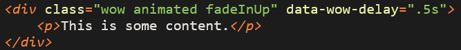
Animations
Just add the classes below to any div/tag. The 3rd class is the actual animation name. REFER TO THIS for all the different animation names. data-wow-delay is how long the delay is from when the element enters the window.
- Note: you can't add this to a div that has a class of .d-block, d-none, etc. as animations use these styles/classes to do their thing. In this case, make another animation div that wraps around the div you want to animate.
FlexBox
Understanding this is essential to making fluid layouts that automatically resize and adjust to different screen sizes. Refer to the links below for further information.
Bootstrap Flex Docs FlexBox Crash Course Excellent Training VideosIMAGES: Regular Images
This all matters because the difference between a 6000 x 4000px image @ 10,000kb and a 600 x 400px image @ 100kb means 100x faster loading speeds, for the latter. This directly effects Google SEO scores, for sure. They prioritize faster loading above many other things, and images are the #1 contrbiutor to slower load speeds.
These are very general sizes for standard images. We usually just add a class of .w-100 to make images fill the width of their container, but there are always exceptions to the rule. And, NEVER SET A HEIGHT. Height will be determined automatically based on width.
Alternatively, if we aren't using .w-100, width needs to be set with the STYLE tag. IE: < img src="/imagename.jpg" style="width: 400px; max-width: 100%;" >
- This makes the image 400px wide, but it will not exceed the width of 100% of its container.
Any image displayed at the full width of a desktop monitor should be 2000px wide, saved at ~30 quality in Photoshop. If this makes the image look very bad, bump it up to ~40.
Images of this width should be 1600px wide, @ 30-40 Photoshop quality.
Images of this width should be 1300px wide, @ ~40 Photoshop quality.
Images of this width should be 1000px wide, @ ~40 Photoshop quality.
Images of this width should be 750px wide, @ 40-50 Photoshop quality.
Images of this width should be 350px wide, @ ~50 Photoshop quality.
EXCEPTIONS
The below example uses images that are somewhat smaller on larger screens, but if you shrink your window or view on a smaller device, you will notice that images get BIGGER. So you will need to save your source image LARGER than it actually appears on a desktop monitor.
In this example, the images should be 800px wide. And they all need to be equal in height if you want them to line up properly.
- Also note: In general, as a rule of thumb - if you are inspecting the largest version of an image based on screen size, to find it's displayed dimensions, you will want to save your source image about 15% larger to account for screens with higher resolution that can display more pixels per inch.
- And consider if you are working on a small laptop - many people have a bigger screen than you, so you need to adjust your image sizes accordingly - make them slightly bigger than you would think.
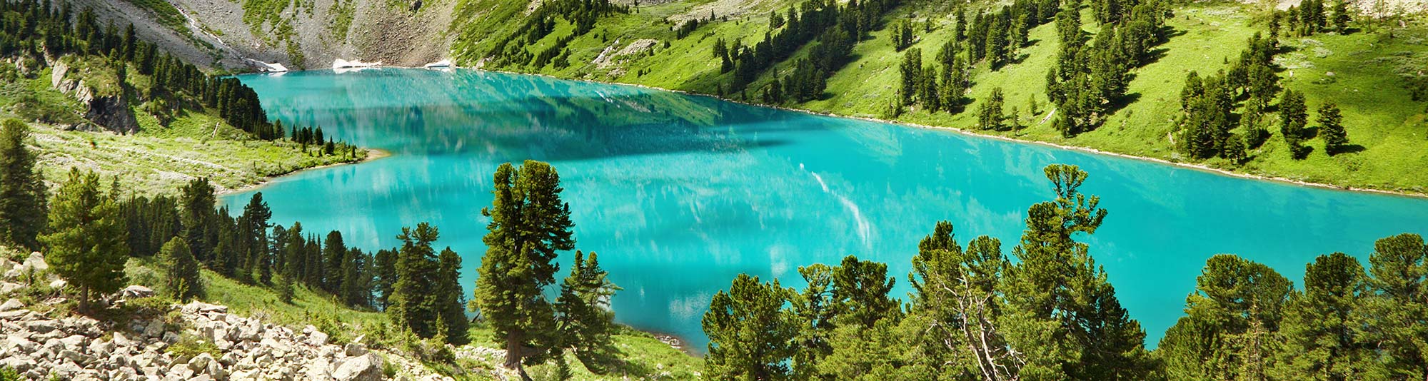
Background Images
Backround images behave differently than regular images. They can be set to "cover" or "contain" within a bounding box. This means that parts of the image will be cropped out depending on screen size and the size of its container, if set to cover, which is what we usually use.
Using the image below (which is actually 2000px wide, more than big enough,) you can see how the image is cropped across different screen sizes.
Resize your window to see the bounding box adjust the image based on the height of the text next to it.
Lorem ipsum dolor sit amet, consectetur adipiscing elit. Vestibulum lobortis feugiat lectus at mollis. In lobortis nulla tempus quam eleifend, sed eleifend nisi fermentum. Vivamus a interdum diam. Maecenas vestibulum, leo id viverra consequat, arcu nunc porttitor ipsum, pellentesque luctus augue tortor bibendum erat. Lorem ipsum dolor sit amet, consectetur adipiscing elit. In molestie pharetra dolor sit.
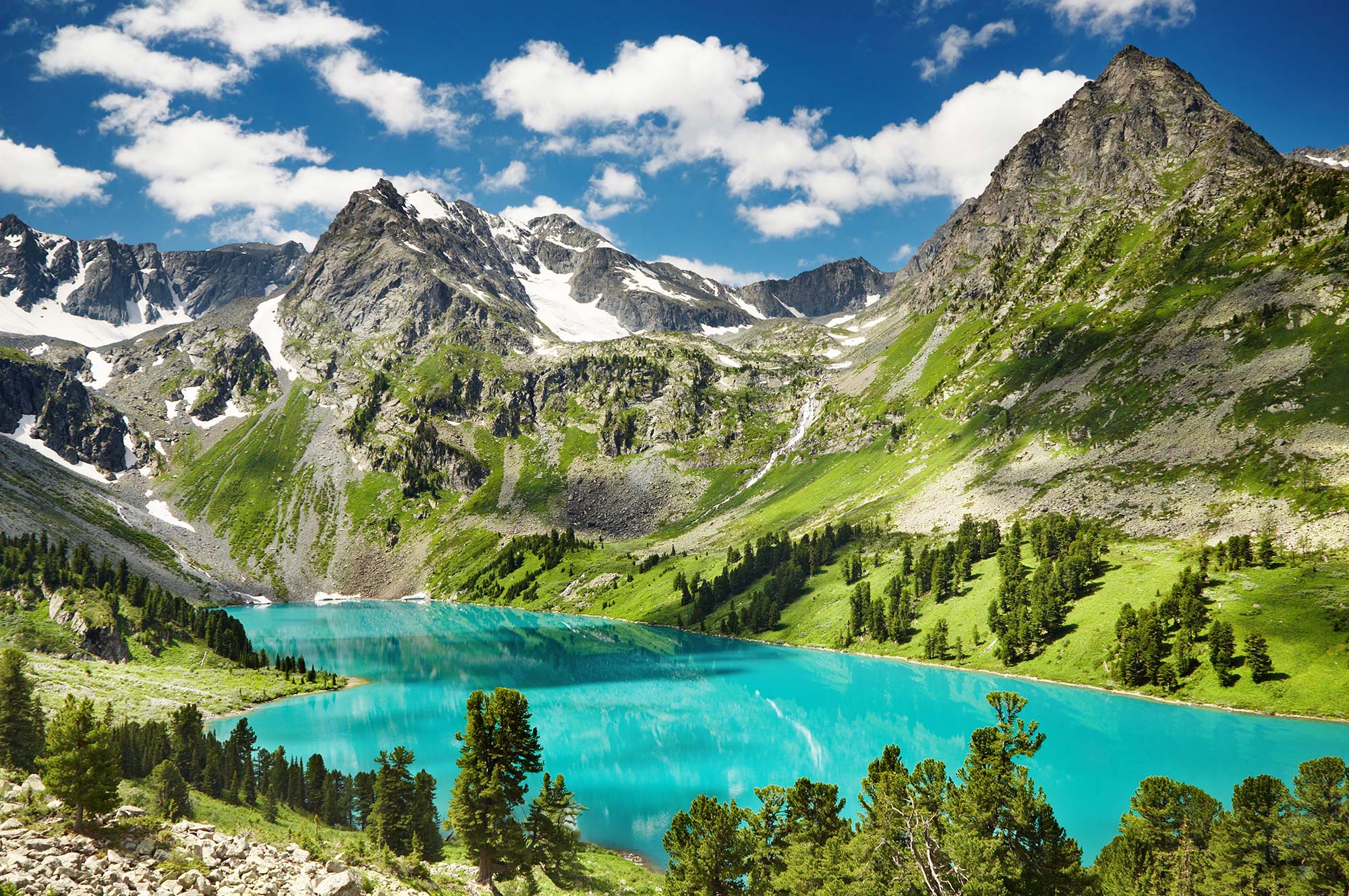
Here is the same image, with more text. You can see that having more text gives us a better cropping for the image, on large screens, at least. Keep this in mind.
Lorem ipsum dolor sit amet, consectetur adipiscing elit. Vestibulum lobortis feugiat lectus at mollis. In lobortis nulla tempus quam eleifend, sed eleifend nisi fermentum. Vivamus a interdum diam. Maecenas vestibulum, leo id viverra consequat, arcu nunc porttitor ipsum, pellentesque luctus augue tortor bibendum erat. Lorem ipsum dolor sit amet, consectetur adipiscing elit. In molestie pharetra dolor sit.
Lorem ipsum dolor sit amet, consectetur adipiscing elit. Vestibulum lobortis feugiat lectus at mollis. In lobortis nulla tempus quam eleifend, sed eleifend nisi fermentum. Vivamus a interdum diam. Maecenas vestibulum, leo id viverra consequat, arcu nunc porttitor ipsum, pellentesque luctus augue tortor bibendum erat. Lorem ipsum dolor sit amet, consectetur adipiscing elit. In molestie pharetra dolor sit.
In the above images, you'll notice that once the image stacks, it no longer has any height because there is no text to tell it how tall to be. Using a media query and some CSS, we can fix that for the following example.
< style >
@media(max-width: 767px){
.background-image {
padding-bottom: 60%;
}
}
< /style >
This is the media query that means "up to medium (-md)" size.
Resize your window to small, and you will see that the image now has height (100:60 aspect ratio - based on the 60% padding-bottom) when stacked.
- Note: Refer to the "EXCEPTIONS" above - If we do those as background images instead of regular images, we can use the padding-bottom method to set the height of all the image sections. This way, you don't have to make the images all the same size, and they will simply fill the available space.
Lorem ipsum dolor sit amet, consectetur adipiscing elit. Vestibulum lobortis feugiat lectus at mollis. In lobortis nulla tempus quam eleifend, sed eleifend nisi fermentum. Vivamus a interdum diam. Maecenas vestibulum, leo id viverra consequat, arcu nunc porttitor ipsum, pellentesque luctus augue tortor bibendum erat. Lorem ipsum dolor sit amet, consectetur adipiscing elit. In molestie pharetra dolor sit.
Lorem ipsum dolor sit amet, consectetur adipiscing elit. Vestibulum lobortis feugiat lectus at mollis. In lobortis nulla tempus quam eleifend, sed eleifend nisi fermentum. Vivamus a interdum diam. Maecenas vestibulum, leo id viverra consequat, arcu nunc porttitor ipsum, pellentesque luctus augue tortor bibendum erat. Lorem ipsum dolor sit amet, consectetur adipiscing elit. In molestie pharetra dolor sit.
Image Resolutions
One final note. In the example below, we've used a 650px wide image, which would appear to be about big enough. However, if the amount of text grows, or the screen shrinks, the image has to GROW in order to fill the entire height of the image area. This stretches the image vertically, and the left and right sides of it get cropped out. Look closely.
You will notice how the image quality degrades as you shrink your window size. Keep this in mind. In general, background images like this need to be much bigger than they appear on a regular desktop screen. Maybe even double what you think it should be.
Lorem ipsum dolor sit amet, consectetur adipiscing elit. Vestibulum lobortis feugiat lectus at mollis. In lobortis nulla tempus quam eleifend, sed eleifend nisi fermentum.
Vivamus a interdum diam. Maecenas vestibulum, leo id viverra consequat, arcu nunc porttitor ipsum, pellentesque luctus augue tortor bibendum erat. Lorem ipsum dolor sit amet, consectetur adipiscing elit. In molestie pharetra dolor sit.
Lorem ipsum dolor sit amet, consectetur adipiscing elit. Vestibulum lobortis feugiat lectus.
Next Section
Something else that people should understand...